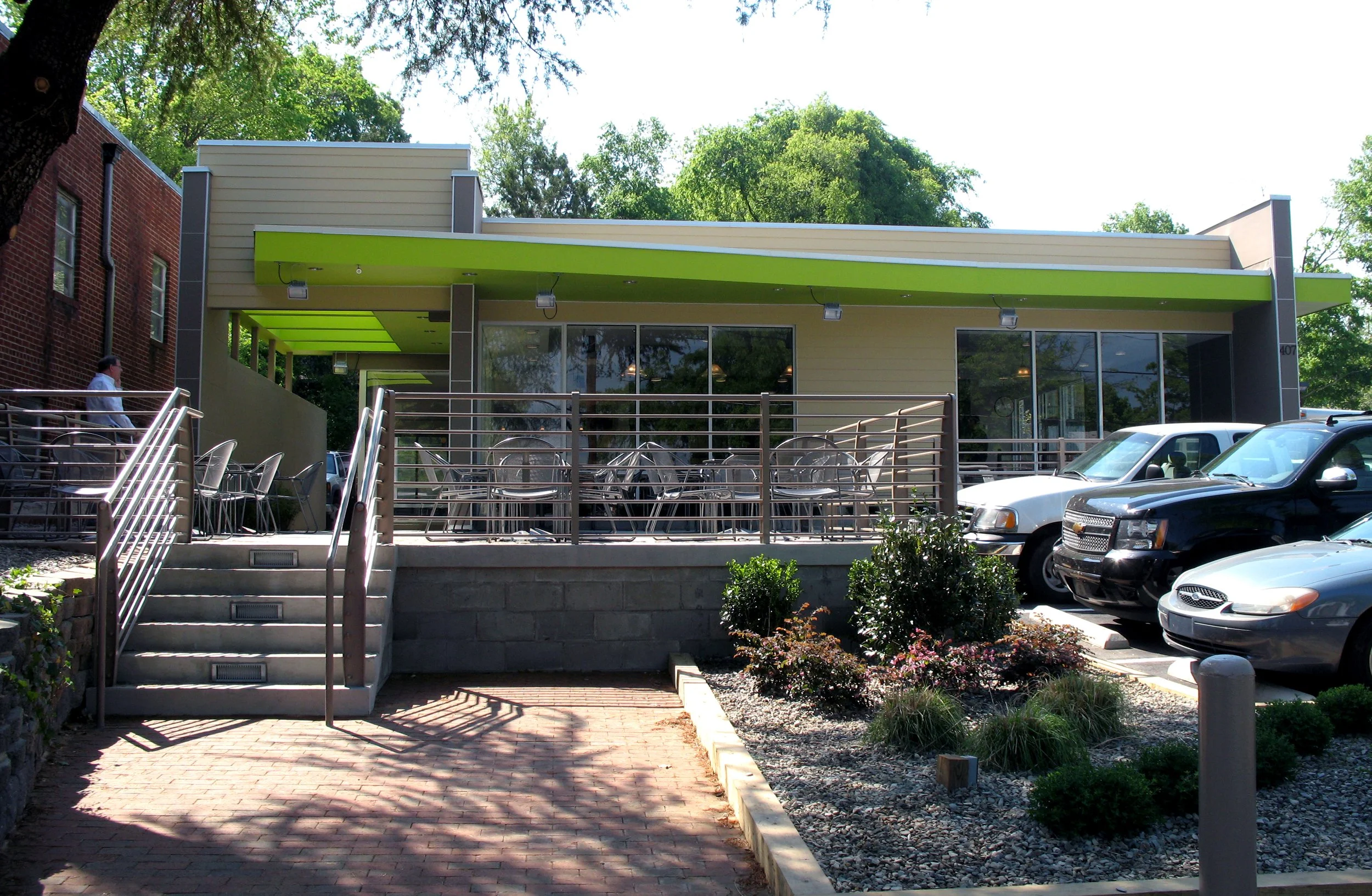
The finished exterior is more inviting and lively.
Early in my career, I was the lead project manager and designer at a previous firm called NCDG, working under a licensed architect. A chef came to us with a dream of creating a sandwich shop. The building had a kitchen of sorts, a dilapidated patio, and a tree growing oddly close to the exterior wall. Honestly, I wondered how it hadn't already been condemned.
That's what I love about adaptive reuse. You start with something rough, look beyond what it is, and imagine what it could become.
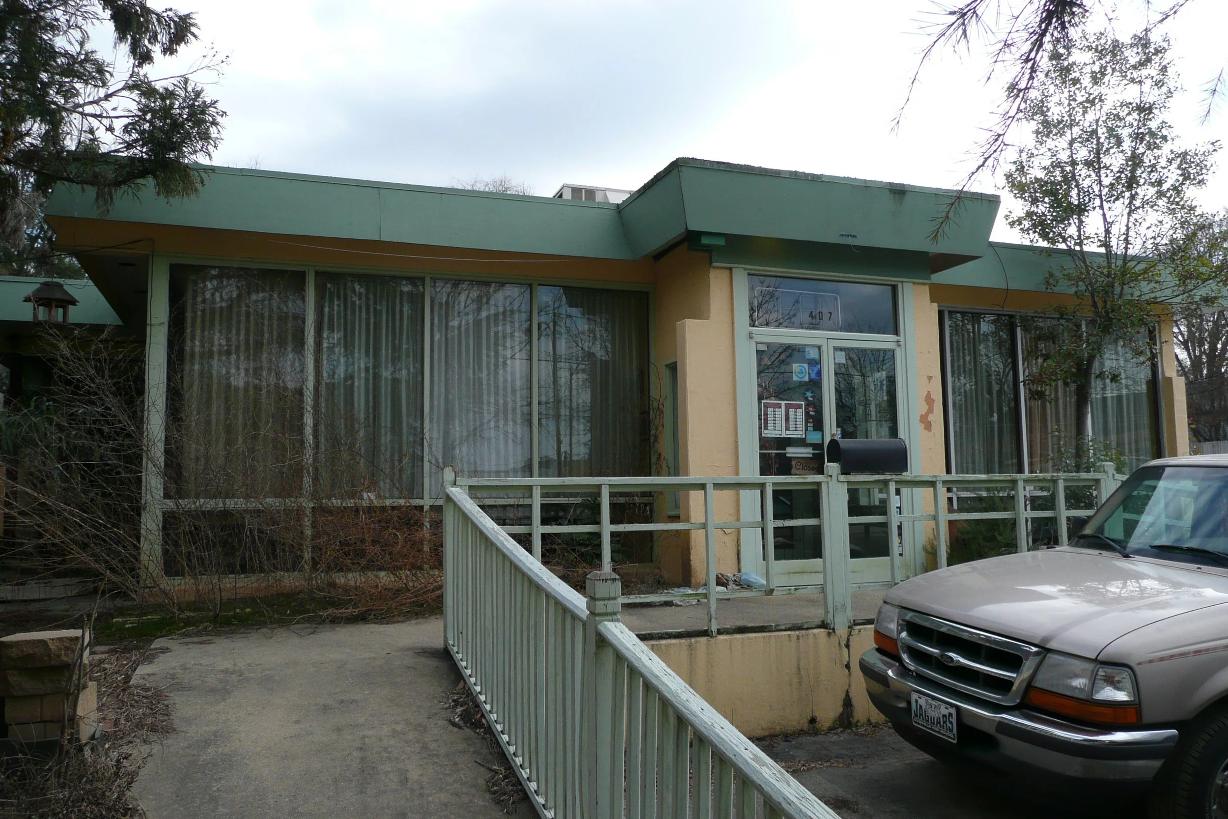
This is what the building looked like before we started.
Designing on a Budget
The chef knew exactly how he wanted the kitchen and the interior to flow; however, the exterior was a blank page. We got to create it from scratch. The budget shaped almost every decision along the way.
To support the new flow, we closed up the original front entrance, which faced the parking lot, and moved the entries to either side of the building. On the exterior, we clad the building in Hardie board, a cost-effective way to cover a large surface area, and used reveal joints to give it the rhythm of brick. We painted it in two main neutral tones and added a vivid green accent that makes the shop hard to miss.
The patio was rebuilt, the parking lot was refreshed, and we put in new storefront glass across the front. An angled canopy added shade and weather protection and gave the signage a place to land. We also cut light wells into the structure, open to the sky, so outdoor seating could stretch along the side. We planted bamboo along the floor-to-ceiling windows.
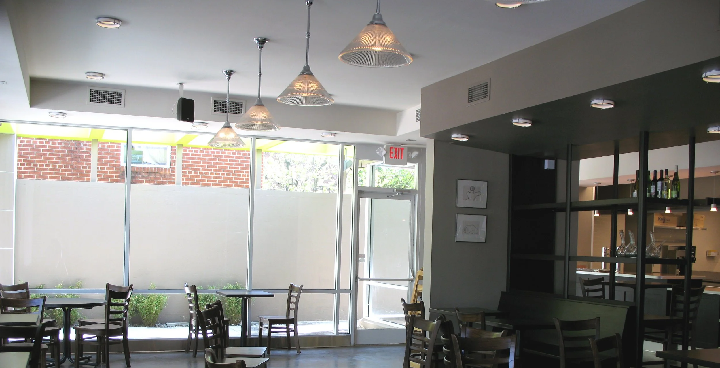
Floor-to-ceiling windows bring in plenty of natural light, while the partition to the right helps direct traffic and keep the flow moving smoothly.
Inside the Space
The kitchen stayed at the back of the building, but we modified it to fit the way the chef wanted to work, with the pickup bar close by. The existing concrete floors were durable enough to keep, so we polished and sealed them. An archway and a small screen wall separate the ordering line from the seating. Because the entrances sit on the sides, people walk straight to the counter instead of cutting through the dining room. It's a small shop, with room for about fifty people, but we wanted a relatively open feel.
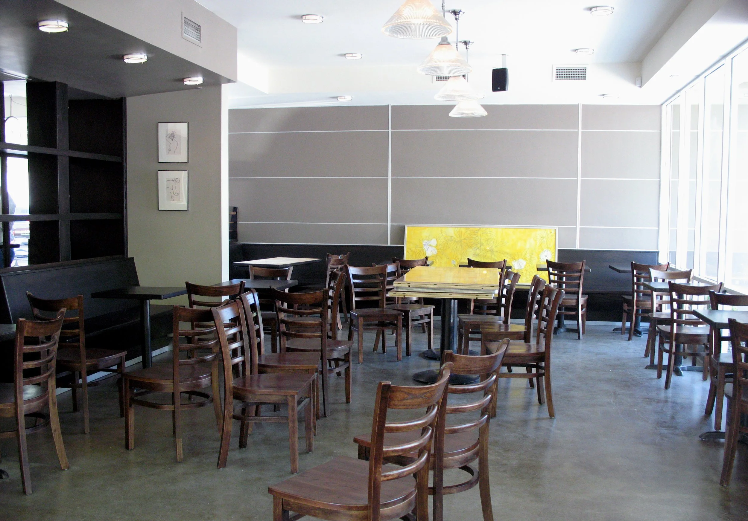
We carried the large platform Hardie board inside.
The Challenges
The biggest hurdle was Chapel Hill zoning and permitting. With the town’s emphasis on preserving its historic downtown, navigating the approval process required some extra care. The second challenge turned out to be a gift. With no direction from the client, we brought forward an exterior concept that they loved.
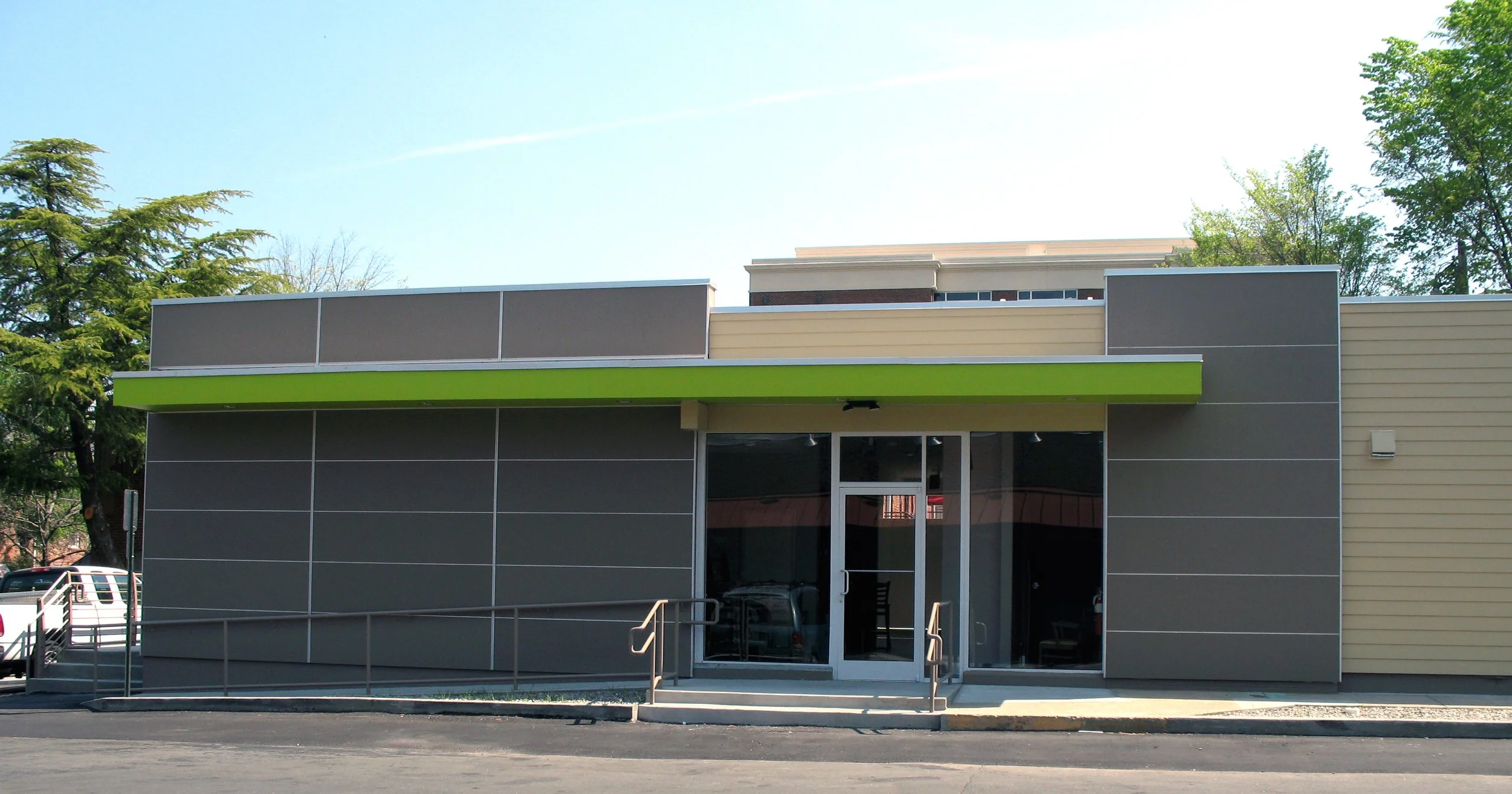
A view from the side entrance.
What I Took From It
This project taught me how to navigate the complexities of designing in a historically sensitive downtown, but it also reinforced the importance of trusting my instincts as a designer. When the client leaves room for interpretation, there's an opportunity to create something unexpected.
What I'm most proud of is the transformation itself. We took a neglected building and gave it a new identity, all on a modest budget. It's a reminder that good design isn't always about starting from scratch. Sometimes, it's about seeing what's possible in a place others might overlook.