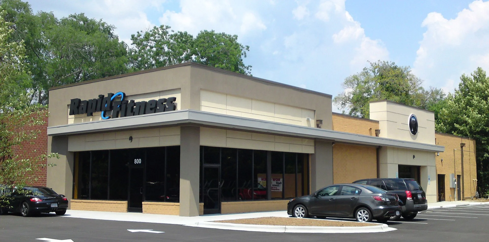
We opened up the corner with glass to let in more light and showcase gym members working out.
When we first looked at this project, the building was an empty former dollar store, just under 12,000 square feet. The tenant, Rapid Fitness, wanted a personal training gym, but the building owner wanted to be able to lease the space to someone else later. So it needed some character, but not so much that only a gym could use it.
I was the lead project designer at NCDG, my previous firm, developing the design and drawing set under the licensed architect. The budget was tight, so we put the money into the exterior and the layout and kept the rest simple.
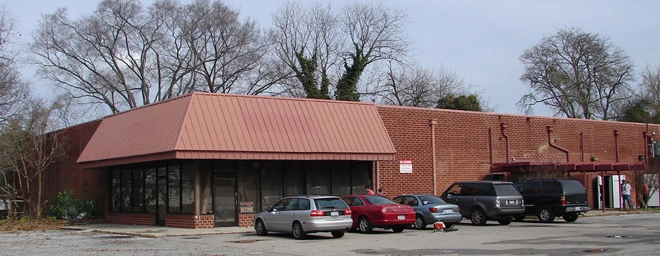
This is what the building looked like before we started renovating.
The Exterior
We left much of the existing brick and added an EIFS in gray and light cream. The finishes mark the building’s corner and side entrance, and a canopy connects the two and gives shade and cover from the weather.
One detail came from an architectural product magazine. I’d seen a textured finish I liked, but it cost about three times what we could afford. Instead, we carved irregular lines into the insulation to create a similar effect. It added texture without making the building overly decorative or tying it to the gym’s branding. Sometimes renovation is about finding a good solution within the limits you have.
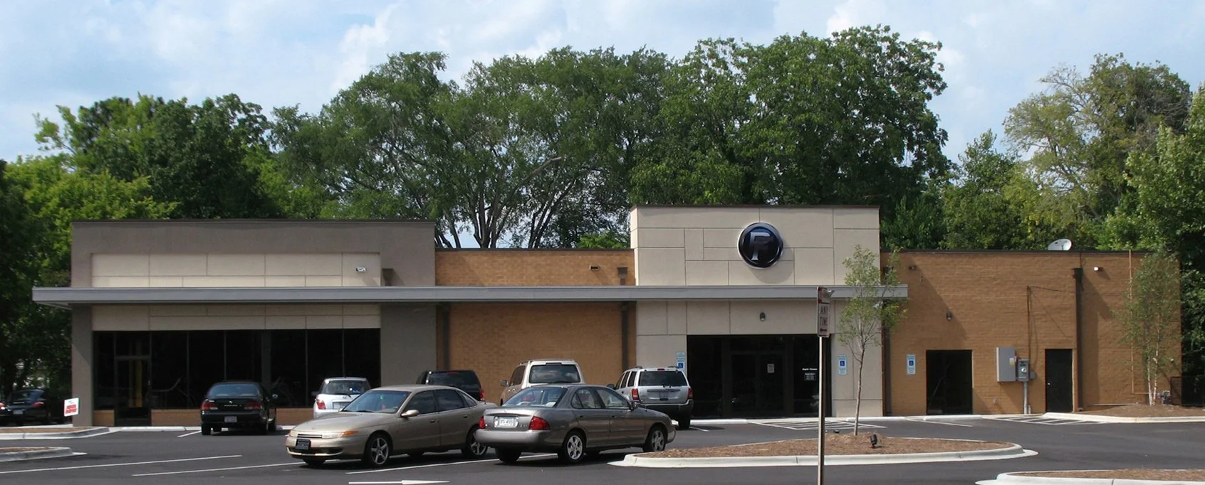
The carved, textured finish adds subtle visual interest and dimension to the exterior.
Making a Smaller Space Work
Rapid Fitness’s typical location is about twice this size, and we still had to fit workout areas, consultation rooms, locker rooms, and a yoga studio. We used angles and curved walls to make the layout more interesting, which created a nice lobby area and then we used a glass corner in the main workout area to show all the action to people walking or driving by. The consultation rooms behind the lobby are enclosed so clients can talk privately. Then we put the yoga studio in the back, away from the noise, and added frosted glass to keep it private but still allow for light flow. Each decision helped the space work harder without making it feel crowded.
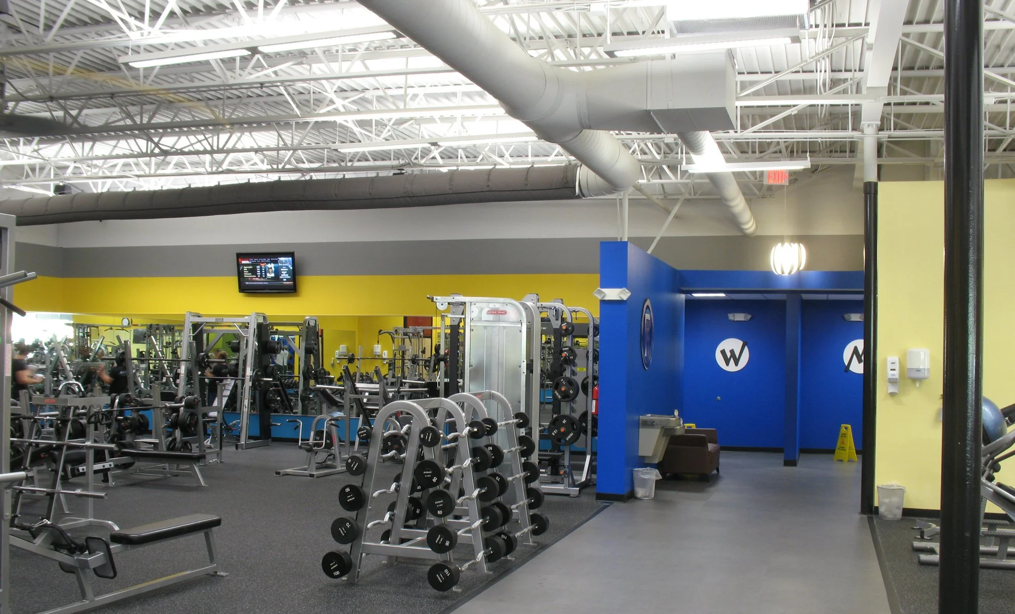
The exposed white structure, paired with soft, indirect lighting, creates a bright yet comfortable atmosphere throughout the space.
Color and Light Inside
The client wanted different colors for different workout zones. To keep the colors from fighting each other, a continuous gray line runs through the whole interior.
We left the structure exposed and painted it white. We used what's called direct indirect light fixtures so the lighting is softer. 70% down on the work areas, 30% up. Some fixtures light the floor directly, and others point up at the ceiling, so the light bounces back down. It’s softer than the bright overhead lighting in most gyms.
These are subtle gestures that help the space feel cohesive.
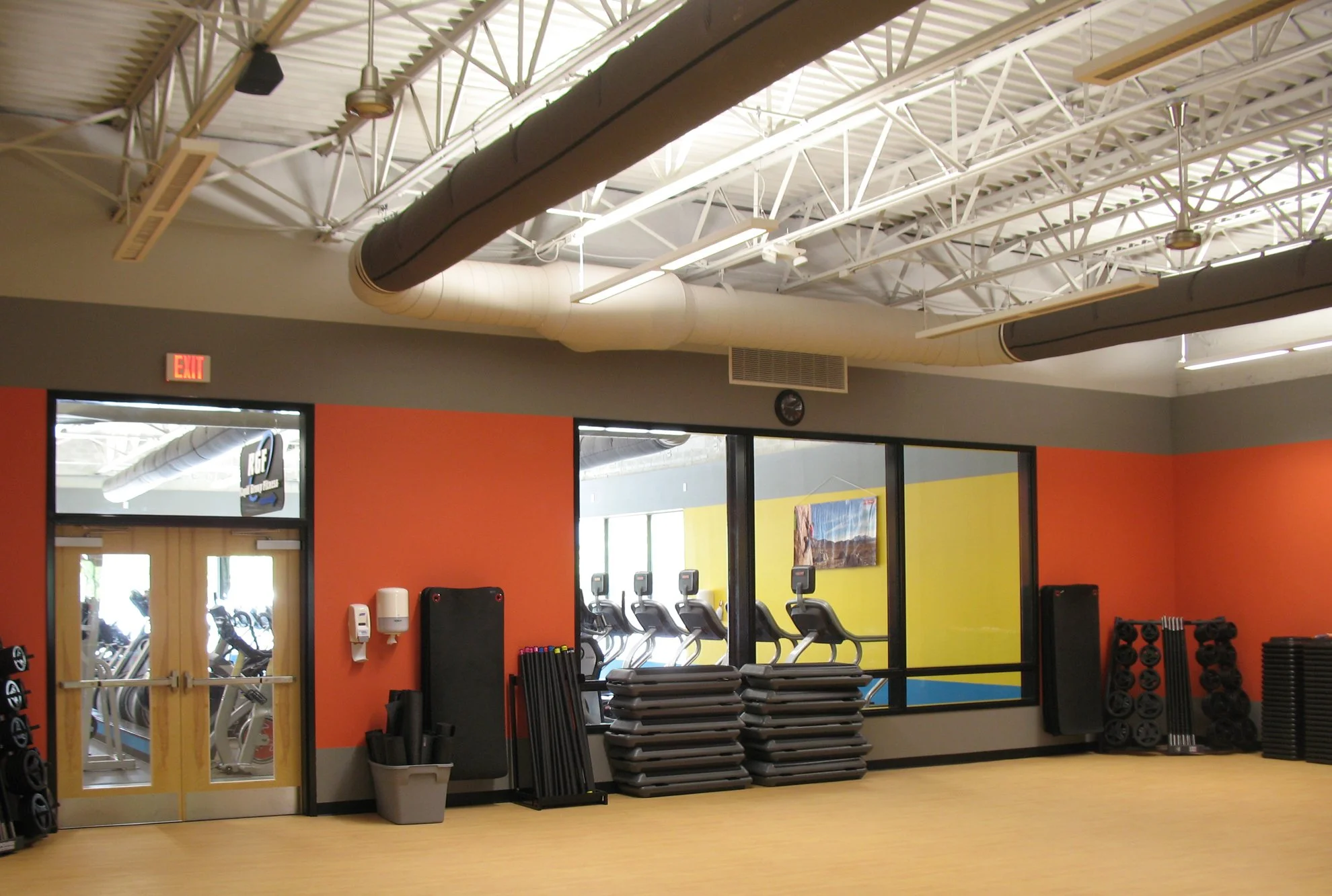
A view from inside the yoga studio looking out to the main area.
Working With What You Have
What I enjoy about projects like this is figuring out what an ordinary building can become. You don’t always need to start over. Sometimes, the right changes to the facade, layout, and lighting can make a real difference.
The goal here was to create a gym that worked well for Rapid Fitness while keeping the building adaptable for future tenants. That balance is what makes adaptive reuse interesting—making the most of what’s already there, without limiting what it could be next.